Bespoke mapping in Tableau
 Tom Brown
I would imagine that more often than not, the default maps provided by Tableau are sufficient for most peoples needs, but occasionally you will come across a need to present data on a bespoke map – typically this will be a map showing regions which are not standard geographical areas.
Examples of these include:
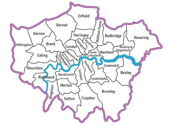
- London boroughs, as I use in this example
- Parliamentary constituencies
- Health service boundaries (SHA, PCT etc)
- Or perhaps the sales regions you define within your own organisation.
These maps are relatively easy to find on the web, here are a couple of examples:


So how do we go about plotting data on top of these maps? The secret lies in the fact that Tableau supports background images – these can be maps, or indeed they can be any other image (such as teeth, in this example from Tableau).
STEP 1 – Get some data, and then add the plot coordinates to it
In my example, I’m using London borough data. So I start with a data set which lists the London boroughs (this file is available at the end of this post). I now need to supplement the data set with the X,Y co-ordinates from my map, at the point I would like the data point to appear. To do this, I used Snag-IT from techsmith.
Firstly, I took a screen capture of my map. I will then use this as the background image, and also to determine the X,Y co-ordinates of my data points.
From the screen capture, I took a look at the picture size – snag-it tells me it is 566x414. These are the limits of my X,Y co-ordinates, and also happen to be the pixel size of the image. I can now simply hover over each of the locations I would like my data to plot, and get the pixel position from Snag-IT (it is displayed in the status bar) – and then update my data set to include these pixel positions.
You might be able to see the pixel position in this image if you look carefully.

NOTE – Snag-IT assumes the origin pixel (0,0) to be the top left of the image, Tableau expects it to be bottom left, so I have calculated the Y position using a simple formula which you will see in the Excel file.
STEP 2 – Open Tableau and connect to your data source
DON’T GET TRIPPED UP HERE - YOU MUST CONNECT TO YOUR DATA SOURCE BEFORE ADDING YOUR BACKGROUND IMAGE!!
Once you are connected to your data source, go and add the background image (the map) by selecting the menu item

When you’re adding the new image, you should see this dialog.

1. Specify the path to your image
2. Choose the fields that contain the X,Y positions that should be used to plot the data point. This is why you need to connect to your data source first.
3. Using the pixel size of the image, set the X and Y limits of the image
STEP 3 – Now draw your viz
You’ll need to put the MEASURES which define your X and Y positions onto Columns and Rows – in my example, I am using the MIN aggregation because I have joined data in a way that created multiple values of my X and Y fields.

You are effectively drawing a scatter plot which is being displayed on top of your image.
When you bring out these fields, the image should be displayed immediately.
Best of luck!! Please feel free to contact us at The Information Lab if you’re having trouble with this one!
Supporting files:
The data in Excel format – Download
The map image – Download
The Tableau workbook (twbx) – Download
Reader Comments (3)
This is a good post - you don't have to stick to maps. There's a great example of using dental maps to visualise teeth problems on the Tableau website using this same technique.
Also, don't forget to untick "Show Header" on the measures - this hides the axes, and disguises the technique you have used to do this.
Good tutorial, I did map: crime in Moscow by districts http://russiansphinx.blogspot.com/2011/02/analysis-of-crime-in-moscow-by.html
Fascinating stuff - especially when one considers that our memory for images is virtually unlimited - graphic representation of data really compelling. Peter