Contact

info@theinformationlab.co.uk
t 08453 888 289

One Alfred Place
London
WC1E 7EB

Newsletter

Subscribe

The Information Lab blog

Tuesday
Jul132010

Simple forecasting using Tableau


So your boss asks you for a forecast – data driven of course, and he wants it in five minutes.  When’s that project going to finish, how many staff are we going to employ in a years time, what will be the final cost of the office move program.

AND I expect your boss wants a chart showing the EXACT date, headcount, cost, whatever.  AND he wants it in five minutes.

Don’t panic.  Crank out Tableau, and your done.

Lets forecast headcount based on the numbers for the last 24 months or so…  we’re looking for a prediction of the next 12 months, and we have 5 minutes to get it done…

Here’s a sample of our data set:image
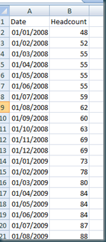
So, its simple enough to plot this out in Tableau, I’m simply going to cut and paste the data right in as its the fastest way…

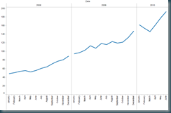
The first visualisation of this data is simply the headcount plotted against the date, thus:

image


Nothing very interesting here right, and hardly a forecast.

But with a few simply changes, we can get some decent information.

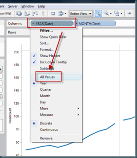
Firstly, using the drop down from the date field, select ALL VALUES.

image

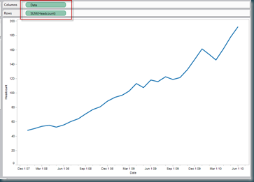
Remove all other dimensions from the column shelf:

image

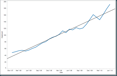
And then add a trend line…

image

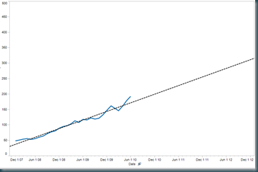
Now by changing the scale on the X axis, to extend the reach of the trend line, we can start to make simple data driven estimates of future headcount.  In my example, I had to edit the Y axis too, as the headcount was growing way past the current data set.  The result is as follows.

image

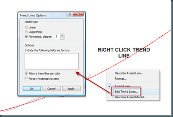
In order to reflect the increasing rate of change of headcount, I’ll edit the trend line as below.

image

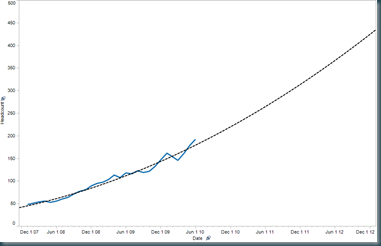
This gives us the following chart, which is pretty close to the finished article:


image

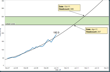
But with a little formatting, and using point markers, we can polish the chart to look like this:

image

This example uses banded reference lines, point markers (which get a dynamic value by dragging the arrow end), and a line end marker to show the current headcount value.

Enjoy.

Tom

Technorati Tags: ,
Wednesday
Apr142010

What does the perfect ad-hoc reporting database look like?


So you have Tableau or another reporting tool which can read from a live database?  But your database has crazy field names, and loads of fields which are holding up your analysis.


What attributes does the perfect data source for Ad-hoc reporting have?


I came up with these – I’d love to know if you can think of more!


1. The data source should be well isolated in the database, so that users can find the correct data source immediately


2. There should be no requirement to create joins to other tables


3. The fields in the data set should be returned in an appropriate order – typically in order of importance, with some grouping determined by the purpose of the data


4. The field names should be semantically correct, using business terms and have a consistent naming convention


5. Fields should be of the correct type so they are interpreted correctly by the reporting tool (date, numbers strings etc)


6. The data source should be high performance (< 2 second response time)


7. Any geo spatial data should be at an appropriate level of zoom – particularly important for postcode data for example (outcode is most often appropriate, rather than the full postcode)


8. The data set should contain no ID fields, except for the primary entity in the data set (i.e. the list of properties SHOULD contain the PropertyID field, but no others)


9. The data set should have the minimum number of fields possible. It is better to handle requests for additional data items than to flood the data set with fields which are not used and confuse the end user)


10. Date fields should be complete dates, not part of dates like year or month.  A good ad-hoc reporting tool will handle this easily.


Enjoy!!  And please let mw know of any more!


Tom


Sunday
Feb212010

Analysing data from ACT! using Tableau


Analysing CRM data is a great use of Tableau, and ACT from Sage is one of the most commonly used CRM applications.  This posts hopes to explain how to get started analysing data from ACT! databases using Tableau.


This is a ‘getting started’ post!  I intend to explain how to analyse data from ACT! which has first been extracted into Excel, rather than by making a direct connection to the database.


STEP 1 – Choose an entity from ACT to analyse, and setup ACT appropriately


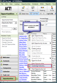
Lets start with ‘Opportunities’.  Go to the opportunities view image in ACT as shown here, and then right click the column headings.  Select ‘Customise Columns’.


In the dialog presented, select all the available fields and move them to the list box on the right.


This will allow extraction of all the fields into an EXCEL spreadsheet which can later be analysed using Tableau.


STEP 2 – Export the opportunity list from ACT! to EXCEL


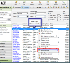
imageExporting the data is as simple as right clicking anywhere on the grid, and selecting the appropriate function.


NOTE – The EXCEL file created by ACT! has two additional sheets which cause problems with Tableau and must be deleted, delete the ‘Opportunities Pivot Chart’ sheet, and ‘Opportunities Pivot’ sheets.


SAVE the EXECL sheet.


STEP 3 – Now we’re ready to analyse this data using Tableau!


This post is not intended to be a training course on Tableau however, there is another post here which should help.  But here are some simple steps to get started analysing opportunities from ACT!


PIPELINE DISTRIBUTION by ‘Stage’


  1. Connect to the spreadsheet using the ‘Connect to Data’ option

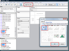
  2. Highlight ‘Total’ and ‘Stage’ in the data window to the left (use the Ctrl key to highlight them both

  3. Hit ‘Show Me’ and select ‘Aligned Bar’ as in the image below


image


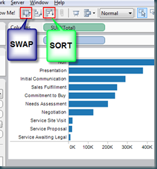
4.   Swap the axis and rank the categories using the toolbar buttons in the image below


image


And there you have it, a ranked bar by sales stage of data from ACT!


What’s next?


This is obviously the first part of a longer story.  There are endless ways to rapidly analyse data using Tableau, and many other entities in ACT! which can be analysed.


In addition, the next stage is also to connect Tableau directly into the ACT! database to remove the need for the EXCEL step – this will be the focus of a post for another day!


Friday
Dec042009

How to learn Tableau Desktop


Tableau is super easy to learn, but in the end, it doesn’t come for free.  You’ll have to put a little effort in, but Tableau have also done a great job of making the trip up the learning curve an enjoyable and easy one.


Here’s how to get from beginner to Jedi in a few days.


STEP 1:  Start by downloading the free trial, unless your boss has been kind enough to purchase the software for you.


Download from HERE.


STEP 2:  Watch the product tour.  This gives a great overview of the product in under 10 minutes and should leave you wanting to know more!  You can find the product tour HERE.


STEP 3:  Start using one of the data sources provided within the Tableau installation files – Coffee Store, or Superstore sales to produce visualisations.  These data sources are relatively rich and contain interesting data which allow you to evaluate the mapping features for example.


STEP 4:  Use the on-demand videos to continue your training – the top level index for these can be found HERE.  These appear to be long (3 hours +), but in reality they are broken up into a series of short clips which are very goal orientated.


Start with the introductory videos, and move into advanced and Jedi topics.


Treat the Advanced and Jedi topics as reference manuals – you do not need to remember everything in these sections, just knowing that these sections exist is enough – come back to them when the need arises.


STEP 5:  To achieve true Jedi status, you’ll need to work with many different visualisations and many different data sources.  Tableau have done a great job of making this possible by providing a suite of examples.  You can find them HERE.


These examples are ‘Packaged Workbooks’ which means both the data and the visualisations are included in the file.  If you download these workbooks and open them into Tableau Desktop, you’ll be able to see how they were built.


I recommend trying to recreate each page (without using ‘Duplicate Sheet’!!) – if you can recreate them all (there are nearly 100), you can truly call yourself a member of the Tableau Jedi.


Cheers


Tom


Wednesday
Nov252009

What’s Tableau Reader?


Tableau reader is a free desktop application provided by Tableau.  It is required to read and interact with Tableau Packaged Workbooks.


You can download your copy of Tableau Reader here.


Tableau reader retains the ability to interact with visualisations created in Tableau desktop, but will not allow connections to data which can be refreshed.  Hence it is useful for reporting data when a snapshot of the data can be created – such as end of month reporting to your clients for example.


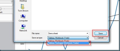
To create packaged files which can be distributed to users of Tableau Reader, you simply use ‘Save As’ from Tableau Desktop – and select ‘Packaged Workbook’:


reader


It is only possible save files as packaged workbooks if the data source chosen is suitable.  This means one of the following:


  • Excel

  • CSV

  • Tableau data extract


You cannot use multi dimensional sources (analysis services for example). 


I’ll post another time on using extracts – but that’s the way to make packaged workbooks when you are using data sources such as SQL server.


Good luck


Tom